The design challenges of gender-neutral signage
Public sector organisations and businesses are increasingly incorporating gender-neutral language into their communication, but with public toilets, the architectural legacy of urinals and stalls poses a challenge for gender-neutral wayfinding signage.
At the centre of the debate around gender-neutral signage are the universally recognized pictograms for ‘Gents’ and ‘Ladies’. For designers, the challenge is to create messaging which is inclusive of all genders without making anyone uncomfortable or confused about which toilet they should be using.
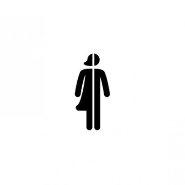
But how do you ‘sign’ toilets in a way that’s welcoming to everyone and doesn’t cause offence? Current solutions include a half male, half female pictogram or the male and female pictograms side by side with a line in between.
Approaches to gender-neutral signage
In London’s Donmar Warehouse Theatre the toilets are no longer defined by gender, the signage simply describes the facilities within the room, putting the choice of occupancy firmly with the user. In this context, we created pictograms to represent the facilities rather than the gender of the user.
We’re also currently working on a commercial project which requires gender-neutral signage for the toilets. This project is set to include gendered toilets and non-gendered individual cubicles to cater for different needs.
What these two projects reveal is that there is not yet a universal standard to gender-neutral wayfinding signage.
Key considerations for gender-neutral signage
The work of a wayfinding and signage designer is governed by the architectural configuration of toilets. For example, where toilets are sited within listed buildings, there may be limited scope to reconfigure them in any other way than ‘Gents’ and ‘Ladies’.
Each building and space is different, so we’ve seen the value of being sensitive and considerate when planning for gender-neutral facilities in a project. At present, the right solution seems to be one of compromise between the architecture of the building and the client’s vision for gender-neutral facilities.
Where space allows, a common solution is to install gender-neutral cubicles, either alongside gendered toilets, or by making every toilet a gender-neutral cubicle. The challenge for signage and wayfinding signage is the need to create a new pictogram for navigation, a simplified and inclusive design that may use pictograms only and is universally recognized.
Design that’s inclusive of all genders
Cubicles are inherently gender-neutral, so only having gender-neutral cubicles is one possibility. However, in 2021 a government consultation revealed that many women feel uncomfortable and unsafe using unisex facilities.
Offering a mix of gendered and non-gendered toilets may be one solution and ultimately gives users a clear choice. But the potential downside is that people opting to use gender-neutral facilities may feel labelled and excluded as a direct consequence of the attempt to be overly inclusive.
Architectural and interior design concerns aside, until a common consensus is reached about the right way to signpost gender-neutral public toilets, there is scope for designers to innovate more inclusive wayfinding and signage solutions.


