Building the DIFC brand and unifying districts
DIFC is made up of multiple areas and districts, a truly walkable ‘city within a city’ experience. But, hard to navigate without guidance. Many places have similar names (such as the Gate District, Gate Village, and Gate Avenue) and given the vastness of the site, as well as the fact that there were multiple entry points, there was a need to help a range of people – from commuters to visitors – easily navigate and orientate themselves in both exterior and interior spaces.
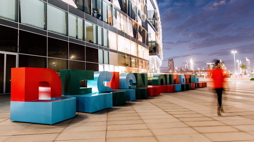
As wayfinding had been added progressively over several years, it lacked consistency and clarity. Our challenge was to create an integrated wayfinding design that connected each individual area – through the use of colour and material – while still showcasing the DIFC brand. Wayfinding also needed to be welcoming and elegant, to reflect the brand’s prestige.
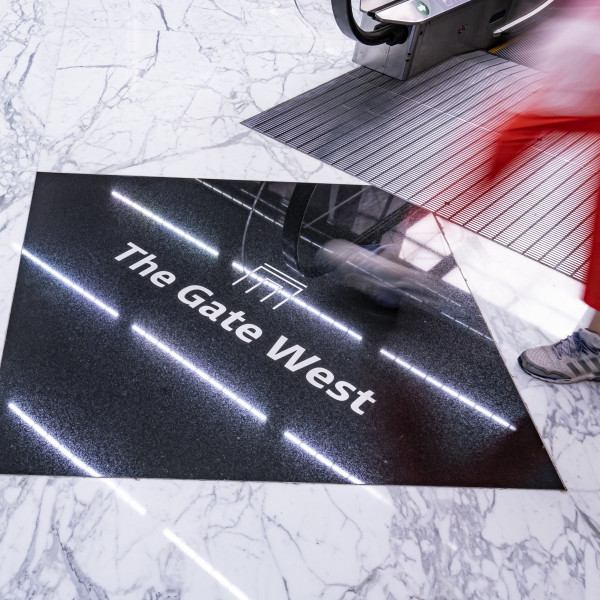
We solved these issues by creating an entire wayfinding sign family that clearly identified districts and buildings, met the overall brand quality standards, and helped improve navigation. One typical challenge we had to consider was to ensure all signs were flexible – so they could change as office tenants came and went – and could be updated easily.



Future-proofing an iconic area
For us, the ultimate aim was to future-proof navigation and provide a positive experience for all visitors. The entire process, including construction supervision, took just over two years – from tender award to completion. During this time, we created and installed rebranded assets right across DIFC – including basement parking areas and all exterior signs, while creating location maps, digital navigational assets, and interior signage.
We are confident that as DIFC further expands, our wayfinding strategy and design will result in increased customer and visitor satisfaction rates as it becomes easier for all concerned to navigate around the environment and get to their destinations quicker.


