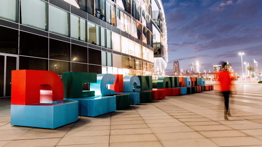
Following the launch of a new brand identity, we were asked to bring the brand to life throughout the highly specified architectural and landscape environment. We were asked to build a better connection between the 5,500-strong workforce community with the surrounding parkland, and create a scheme that matched their own aspirations for the future of the park.
A better connected community
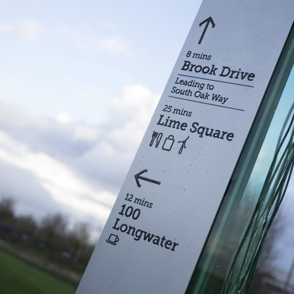
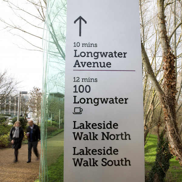
Our wayfinding design captures the spirit of the brand and scale of the environment. Navigationally, we have given users the confidence to strike out and make journeys they previously found unappealing by creating ‘walks’ around the lake, providing estimated walking times to encourage people to engage with them.
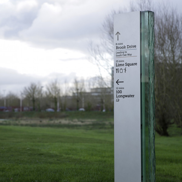
Signs around the site encourage users to interact with the landscape, not only through the information displayed on them, but also through the vistas that are highlighted through each glass fin. During the evenings, these illuminated fins serve as beacons that draw you around the site, the dappled effect of the light helping to blur the boundary between the man-made and the natural.
User-centred and bespoke approach
Our audit revealed that many users of the parkland felt unsure about the routes around the lakes, rendering them unappealing. A key focus of our strategy therefore focused on creating a scheme around the lakeside areas that encouraged people to leave their offices and explore.
Design Approach
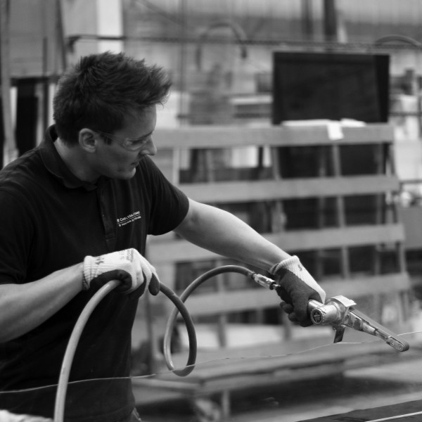
Taking the juxtaposition of the organic forms of the landscape and the highly engineered lines of the architecture as a starting point, we developed a scheme that captured both the softness of the landscaping and the technical finesse of the architecture. Sheets of 15mm glass with riven edges were sandwiched together, encased in powder coated aluminum and illuminated. Viewed head on, the signs are eye-catching; however, viewed from an angle the riven edge of the glass captures and fragments the light shining through it, highlighting the irregularities and gentle ripples that run along the edge of each glass fin and creating an effect reminiscent of ripples upon water, a visual cue that ties the architecture inextricably to the landscape in which it sits.
“Endpoint’s ability to take the brand guidelines, develop them to work in the built environment and to such a high specification really impressed me. We have a beautiful, bespoke result that works and at its best has encouraged people to take a break from their desks and venture out to explore the parkland and lakes beyond. Its beautiful design has drawn wide praise from our occupiers, and as landlord this is the feedback we strive for…”


