The Challenges
Hospitals can be notoriously difficult places to navigate for patients, visitors, and even staff. When you factor in medical emergencies and high-alert situations, it becomes even more important for people to find their way with ease and efficiency.
Endpoint’s initial collaboration with Mediclinic required individual signage and wayfinding solutions for each hospital, whilst maintaining brand consistency across each of the properties. On a technical level, we managed the transition of 2D creative work into a 3D physical signage family, including prototyping, value engineering, and technical specifications.
So when Mediclinic built their latest high-end luxurious hospital in south Dubai – which includes a VIP area – Endpoint used specially created global signage application guidelines to put together a bespoke wayfinding solution.
Dubai is a multilingual, multicultural city, with residents from all over the world, as well as an esteemed local population. So the real challenge was to create a consistent experience for everyone, tailoring the information to the hospital’s users.
The Solutions
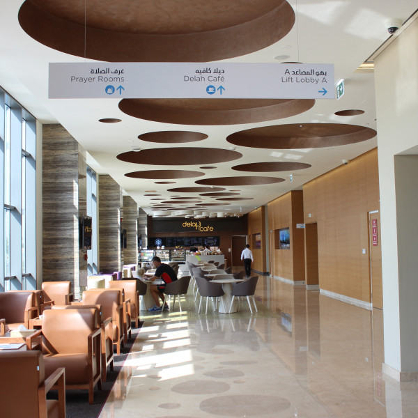
Our wayfinding strategy was built around a detailed analysis of both the hospital’s horizontal and vertical flow and access – specifically in relation to the hospital’s four lift lobbies. It also considered the addition of differentiated signs in the VIP area, plus colour code zoning supported by environmental graphics in the basement parking area.
We focussed our efforts on creating simple and easy-to-follow directions which delivered the right messages at the right times for hospital users. Our approach was informed by research on healthcare wayfinding case studies, and also looked at placemaking opportunities using interactive digital art and kinetic installations, reflecting the vibrant, up-and-coming surroundings of the hospital.
The Impact
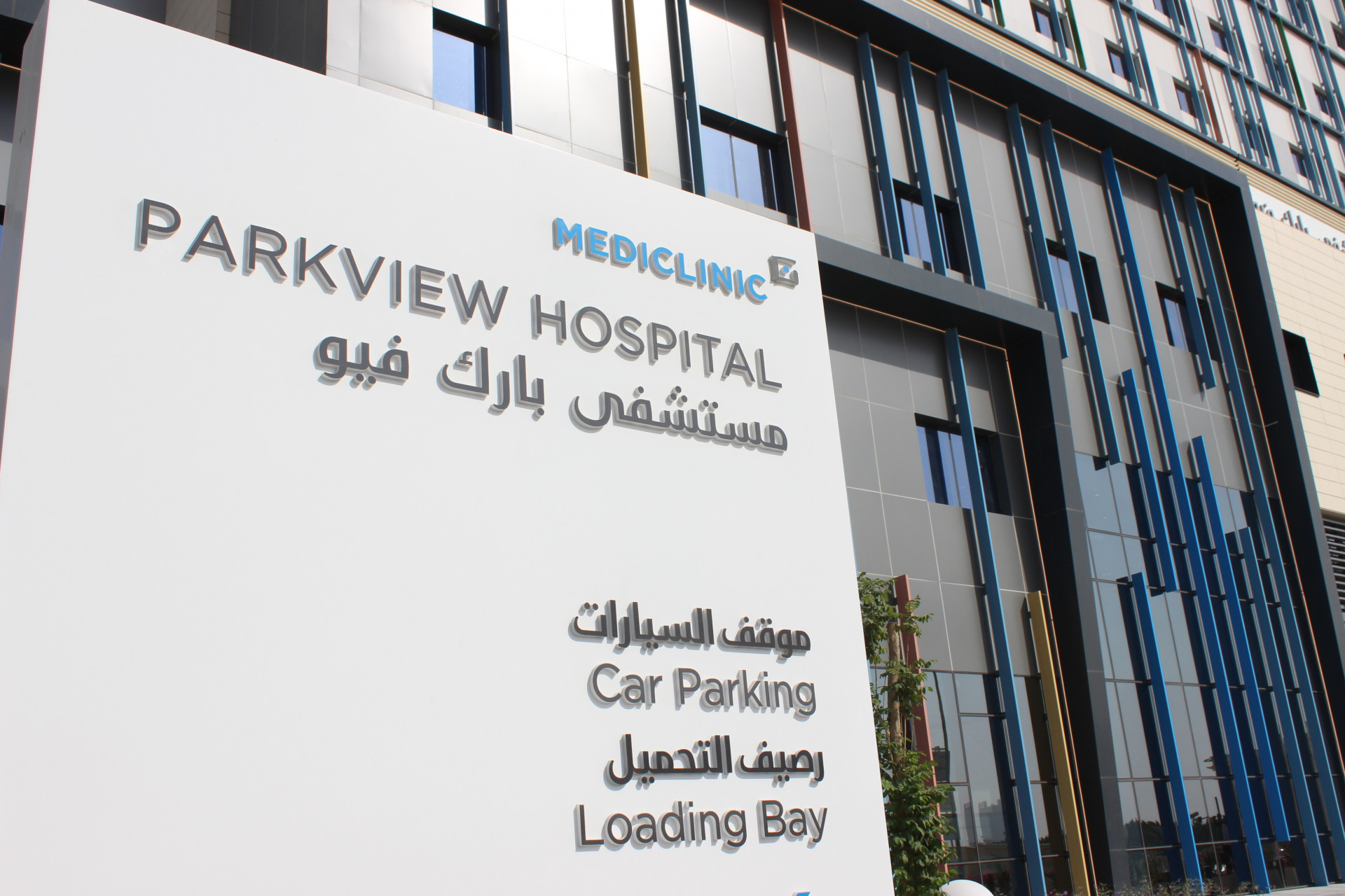
From a business perspective, it’s clear from the signage at Parkview Hospital that it’s part of the Mediclinic portfolio. But it also retains its own individual character, in keeping with its surroundings in a rising residential zone.
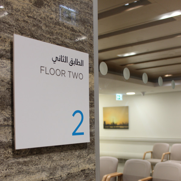
Our overall focus on simple, clear, and straightforward directions with messages delivered at the right locations in English and Arabic means everyone using the hospital has a clear and consistent user experience.


