Navigating A National Museum
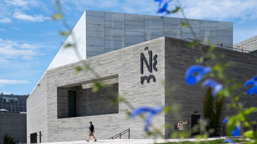
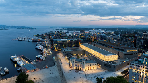
The construction project was managed by Statsbygg – the Norwegian Directorate of Public Construction and Property. Statsbygg appointed Endpoint to design and develop a wayfinding system which would enable visitors to navigate around the building, whether they require a specific gallery, or if they simply need to find the facilities.
The client came to us because of our previous relationships with other cultural institutions and they were specifically searching for a wayfinding agency that had a cast iron foundation in wayfinding strategies. They were unsure about how visitors would navigate the spaces and different parts of the client team had different opinions about how wayfinding might work.
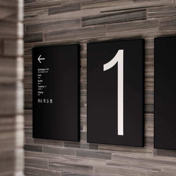
Working closely with the Oslo based design consultancy, Metric, who created the museum’s visual identity, we devised a bilingual wayfinding system that is simple to follow and clear in both Norwegian and English. Pictograms were used throughout to back up the messages for other nationalities.
The Museum was set out in chronological order, but staff were aware that many visitors were unlikely to take a prescribed route – which could potentially take hours to follow. They tasked us to consider how to support visitors when they did follow the routes and when they went along routes that were unexpected. We focused on who would be coming to the museum, how they might actually approach navigation and overlaid this on the layout of the building, we looked for pinch points and reassurance moments.
More Than ‘The Scream’
The Museum was conscious that many visitors would want to head directly to one of the museum’s key pieces, one of the four Munch’s ‘The Scream’. So the wayfinding strategy needed to enable people to make journeys around the building in a way that would encourage them to view other pieces, rather than immediately flocking to a single artwork and leaving again, as had been the case with previous galleries.


Signage As Slated
Stratum of slate dominates the interior design, and there was a strong vision of a space that was flexible – including permanent wayfinding information alongside a system that could accommodate signage for temporary exhibitions.
It was vital that the wayfinding system integrated with the museum’s interior styling, without compromising, or detracting from the finishes. So Endpoint developed a carrier system incorporating a graphic panel – using a magnetic system so that panels for temporary exhibits could be easily exchanged.
In terms of materials, we fabricated two finishes – one for the panel and one for the carrier – designed to complement the strata of the slate. Colour-wise, we offered a non-reflective matt black finish. As we could not drill into the stonework, signage had to be mounted in the mortar. On the reverse of the signs, elongated holes allow the signs to be repositioned over the slate, whilst being attached to the mortar.
The museum undertook extensive testing of the internal and external signs which ensured the sign sizes and locations were correct before manufacture took place.
The building’s architecture presented a few challenges such as vertical access which varied according to your goal, and the main toilets being located on the lower ground level.
There was also detailed discussion and careful consideration around the inclusivity of the signage, such as accessible braille.
The museum building is designed sustainably, with no plastic used anywhere. Consequently, Endpoint designed the sign family using no plastic or acrylics but rather aluminium, glass and marble.
The project went on to win the gold award for wayfinding at the 2023 Visuelt Awards.

"Endpoint helped us realize our vision for the museum with a solid wayfinding strategy that set out clear objectives. Endpoint’s technical team worked through our product design needs to develop highly flexible, simple to maintain, beautiful products. Currently, Endpoint is supporting us with the implementation process. Their expertise and understanding of the cultural sector shine through."
Listen to Ragna Jacobsen discuss the project in more detail on our Wayfinding X Change podcast.

